
As an Amazon Associate we earn from qualifying purchases at no extra cost to you.

Shopping for a creator laptop or a second display for creative work, most people fixate on the wrong numbers. They chase refresh rates they’ll never use in Lightroom, buy “4K” panels with washed-out color, or assume a higher price automatically means better color accuracy. The result is a desk full of gear that renders skin tones like a convenience-store security camera.
The single most misunderstood spec is gamut — the range of colors a display can actually show. A laptop can have a razor-sharp resolution and a fast processor, but if its panel only covers 60% of sRGB, your photos and videos will look wrong on every other screen your audience owns. Below is how to evaluate gamut and the surrounding specs that actually determine whether a display is fit for photo editing, video grading, design work, or casual content creation.
Top 3 picks at a glance
Decide These 3 Things First
Before comparing panels, answer these honestly. They eliminate half the market immediately.
1. What do you actually create? Social media graphics and web content live entirely in sRGB — a display with solid 100% sRGB coverage is genuinely enough. Photography and print work benefit from wide-gamut coverage of Adobe RGB (aim for 95%+) because printers reproduce cyan and green tones that sRGB clips. Video editors working in HDR or modern delivery standards want DCI-P3 coverage of 95% or better. Buying Adobe RGB coverage you don’t need wastes $200–400; buying sRGB-only for print work costs you a reshoot.
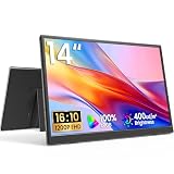
2. Will this be your only screen or a companion screen? A primary editing display deserves a factory calibration report and 10-bit color depth. A travel or secondary monitor — say, a 14-inch 1200p IPS portable that doubles as a client-preview screen — can be a $50–230 accessory where “close enough” is fine, as long as it at least hits full sRGB.
3. What’s your real budget including calibration? Add $60–150 for a colorimeter if you want to maintain accuracy past the first year, because even great panels drift. Budgeting the display alone is how people end up with a wide-gamut screen that’s out of spec within six months.
Gamut Coverage: The Numbers That Matter
sRGB coverage: This is the baseline for everything. Insist on 100% sRGB (not “99% sRGB area” marketing-speak with no measurement standard — look for coverage, not just saturation). Anything below 95% sRGB is disqualified for creative work regardless of resolution. Even budget portables now manage this; an 18.5-inch 2K IPS panel advertising 120% sRGB is comfortably in the safe zone for web-facing content.
Adobe RGB: Only chase this for print photography. Target 95–99% Adobe RGB coverage. Panels claiming 130% sRGB without an Adobe RGB figure are usually just oversaturated sRGB panels — bright, punchy, and useless for print soft-proofing.
DCI-P3: The default for video work and modern content delivery. 95%+ DCI-P3 coverage is the target; anything above 98% on a laptop is excellent. Note that P3 coverage is usually quoted for the DCI-P3 theater standard, but some manufacturers quote “Display P3,” which clips into sRGB better for web work — read the fine print.
Delta E: This measures color accuracy out of the box. Delta E below 2 is where differences become hard to see without a colorimeter; Delta E below 1 is professional-grade. Many serious panels ship with a factory calibration report listing average Delta E — if a manufacturer doesn’t publish this number, assume it’s not flattering.
One trap to avoid: gamut coverage tells you the total range of colors available, not how accurately the display hits them within that range. A panel can claim 100% sRGB and still render every color 10% too saturated. Coverage and accuracy are separate line items, and only the second one matters for repeatable results.
Panel Type and Bit Depth
IPS is the default for creative work for good reason: viewing angles of 178 degrees mean the color you see doesn’t shift when you lean, and modern IPS panels consistently deliver 99–100% sRGB. VA panels offer deeper contrast (often 3000:1 versus 1000:1) but visibly shift color off-axis — annoying when you’re hunched over a grade at 2 a.m. OLED delivers per-pixel contrast and is superb for HDR video review, but static photo-editing interfaces with bright UI elements can raise burn-in concerns over years of use, and many OLED panels still top out around 98–99% DCI-P3 with no Adobe RGB option.
Bit depth matters more than most guides admit. An 8-bit panel shows 16.7 million colors; a true 10-bit panel shows over a billion. In practice, most “10-bit” consumer displays are 8-bit panels with dithering (FRC), which is fine for most work — visible banding in sky gradients is the tell-tale sign you’re stuck with genuine 8-bit and heavy compression. If you grade footage or retouch skin, 10-bit (native or FRC) plus a wide gamut is the difference between smooth gradients and visible stepping.
Resolution, Size, and Pixel Density
For a laptop you’ll use at 18–24 inches from your face, 2560×1600 on a 14–16-inch screen lands around 190–226 pixels per inch — effectively retina, where individual pixels disappear. 1920×1080 on a 15.6-inch panel is about 141 ppi: usable, but you’ll see pixel structure in fine text. 4K (3840×2160) on a 16-inch laptop hits roughly 275 ppi, which is beyond what eyes resolve at editing distance but useful if you output 4K video and want pixel-level inspection.
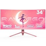
For external monitors: 27 inches pairs naturally with 2560×1440 (~109 ppi) as the value sweet spot, or 3840×2160 (~163 ppi) if you want retina-class sharpness. On the ultrawide side, a 34-inch UWQHD (3440×1440) curved panel gives roughly 110 ppi and a timeline-friendly 21:9 canvas — handy for video editors, though a 1500R curve on a pink gaming-styled ultrawide is a taste decision, not a color decision; curve has zero impact on gamut.
Brightness, Contrast, and Finish
Brightness in nits determines whether you can edit near a window. 250 nits is the dim floor — avoid it for creative work. 300–350 nits handles indoor ambient light. 400–500 nits lets you work in a bright room, and anything above 500 nits enters genuine HDR territory (look for DisplayHDR 400 minimum, though DisplayHDR 600 and above is where HDR becomes meaningful for grading). Don’t chase HDR on a panel that only hits 300 nits — it’s a badge, not a feature.
Contrast ratio: 1000:1 is standard IPS and fine. Matte (anti-glare) finishes preserve color in imperfect lighting; glossy finishes look punchier in dark rooms but turn every lamp into a mirror. Editors in variable environments should default to matte.
Connectivity and Ergonomics
Color-accurate signal paths matter less than people fear — modern USB-C and HDMI carry color fine — but bandwidth does not. USB-C with DisplayPort Alt Mode is ideal for laptops because one cable delivers video, a 60–100W charge, and often USB peripherals. HDMI 2.0 caps at 4K/60Hz; HDMI 2.1 unlocks 4K/120Hz+. If you’re buying a portable second display, confirm it supports USB-C video input (not just power) — cheaper models accept USB-C only for power and force you to carry HDMI.
Ergonomics for long editing sessions: look for height adjustment of at least 100mm, tilt from -5 to +20 degrees, and pivot if you retouch vertical-format social content. VESA 100×100 compatibility is non-negotiable for arms; note that many portable monitors still include VESA patterns (75×75 or 100×100) paired with magnetic or folding kickstands, which is worth checking if you travel.
Price Tiers: What Your Money Buys
Budget ($40–250): This tier includes capable portable monitors and basic desktop panels. Expect 100% sRGB (sometimes quoted as 120%), 8-bit + FRC, 250–350 nits, 1080p to 2K resolution, and no factory calibration. Examples: a 14-inch 1200p ultra-slim portable at around $49, or an 18.5-inch 2K 120Hz 120% sRGB unit at $230. Perfect as secondary/travel screens; acceptable as sole displays for web-only work.
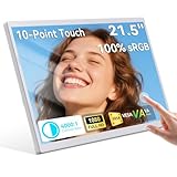
Mid-range ($250–700): Here you get genuine 99% sRGB with published Delta E under 2, 10-bit support, 350–400 nits, and often 95%+ DCI-P3. A 23.8-inch touch panel with 99% sRGB at $180 sits at the entry of this range. This is the sweet spot for working photographers and freelance video editors.
Premium ($700–2,500+): Factory-calibrated wide gamut (99% Adobe RGB or 98%+ DCI-P3 with sRGB clamp modes), average Delta E under 1.5, hardware calibration support, built-in shading hoods, and 4K at 27–32 inches. This tier is justified by paid print work, client-facing grading, and anything where a color error costs a re-print.
Spec Checklist
| Spec | Budget | Mid-range | Premium |
|---|---|---|---|
| sRGB coverage | 95–100% | 100% | 100% + sRGB clamp |
| Adobe RGB | Not specified | 85–95% | 99% |
| DCI-P3 | Not specified | 90–95% | 98%+ |
| Delta E (factory) | Unpublished | < 2 | < 1.5, calibration report included |
| Bit depth | 8-bit | 8-bit + FRC | Native 10-bit or better |
| Brightness | 250–300 nits | 350–400 nits | 400–600+ nits, DisplayHDR |
| Resolution/size | 1080p–2K, 14–24″ | 1440p–4K, 24–27″ | 4K–5K, 27–32″ |
| Typical price | $50–250 | $250–700 | $700–2,500+ |
Red Flags
- “120% sRGB” with no coverage figure. Saturation isn’t coverage; oversaturated panels misrender standard content.
- HDR badges on 250–300 nit panels. Real HDR needs 600+ nits and local dimming or OLED.
- No factory calibration data. If Delta E isn’t published at this price, it’s because it’s bad.
- VA panels marketed for “accurate color.” Off-axis shifting undermines any gamut claim.
- Refresh rate as the headline spec. 165Hz or 200Hz means nothing for color work; a 60Hz panel with better gamut is the right pick.
- Gamut claims without a measurement standard. Reputable specs state whether figures are coverage or area and against which color space.
FAQ
Is 100% sRGB enough, or do I need a wide-gamut display?
For web, social, and video delivered in standard formats, 100% sRGB with Delta E under 2 is genuinely sufficient — arguably better than an unmanaged wide-gamut panel, which oversaturates sRGB content unless it has a proper sRGB mode. Step up to Adobe RGB or DCI-P3 only when you print photos or deliver in wide-color pipelines.
Do portable monitors work for real editing?
As a secondary screen for palettes, reference, or client review, absolutely — a decent 2K portable covering 120% sRGB costs $200–250. As your primary grading display, no: most ship uncalibrated, and brightness (typically 250–300 nits) is marginal for critical work.
How often should I calibrate?
Every 4–6 weeks if color accuracy is part of your deliverable; every 2–3 months for general content creation. Panels drift gradually, so annual calibration leaves months of subtly wrong color in your work. A colorimeter costs $60–150 and pays for itself in one avoided re-print.
Does refresh rate matter for creative work at all?
Barely. 60Hz is fully adequate for editing, grading, and design. Higher refresh rates make cursor motion and scrolling smoother, which some people find pleasant, but they consume budget and GPU headroom that would buy better color. Prioritize gamut, accuracy, and resolution first — spend on refresh only after those boxes are checked.
Heading into 2026, the good news is that honest full-sRGB color is no longer a premium feature — even $50 portable panels hit it. The differentiators at higher prices are accuracy, wide gamut, bit depth, and brightness. Spend accordingly.
Related guides
- Alienware 16 Aurora RTX 5070 Review: Display, Portability and Configuration Gaps
- Lenovo Legion Pro 7i Gen 10 Review: 64GB RAM and Dual-SSD Configuration
- MSI Katana 15.6-inch RTX 5050 Review: Configuration Strengths and Upgrade Unknowns
- ASUS ROG Strix SCAR 16 G635LX-XS97 Review: Display Ambition, Upgrade Questions


